Introduction
My relationship to the natural world is experiencing peace and calm sitting in a field. I would go to forest and a crowded area like London to see a landscape. People take pictures of nature because it look nice or it calming picture. Photographs can change the way how we see things by looking at landscapes from a different perspective.
What is landscape picture?
When I see the word landscape, I think of summer time and calmness. The words I associate with landscape are calm, bright, peace, field, green, outside, adventure, trees, people, animals and sunset.


I pick theses Pictures from the google because it represents the landscape for me like if I think of landscape that what Pictures will pop up in my mind.


I took the photo around the school by landscape and I got lots of bushes or trees but I really can't remember when or why reasons the I took those photos.
CONSTRUCTED SIDE.


Feeling overwhelmed at the hugeness of the landscapes she is taking photos of.
In one image she wants to show everything she sees and feels about the landscape trying to show all the different angles of the landscape in one frame. my side is constructed and I pick a side .
In one image she wants to show everything she sees and feels about the landscape trying to show all the different angles of the landscape in one frame. my side is constructed and I pick a side .
THE IDEA OF LANDSCAPE.
|
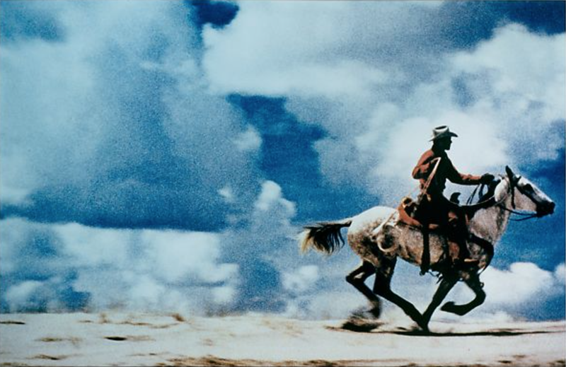
The artist has chosen to include the horse and the rider into the picture on the right. Most of the image is made up of the blue sky with the clouds. I think that he was talking a photograph of the landscape and someone appeared. I think the photograph was taken head on as the angles of the image show the landscape clearly. It looks like it been take from a close angle.
I think the artist represents the landscape of old and try to show what it looked like back in the day. |
|
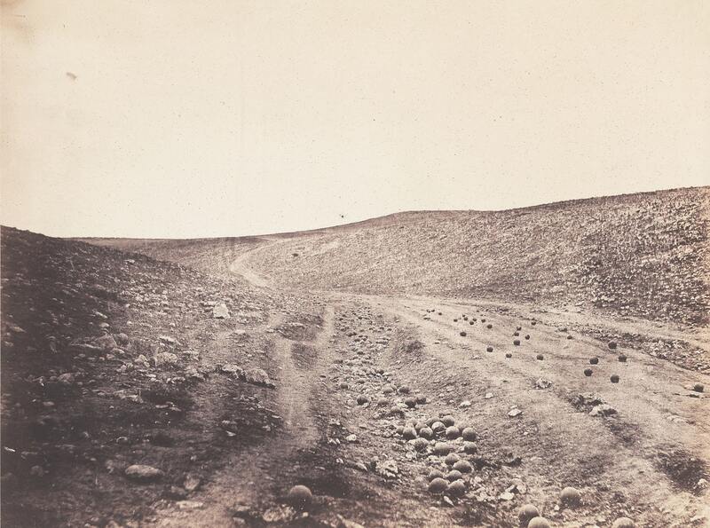
I think that the photograph shows that perhaps the photographer is local to the landscape and is familiar to the landscape. I think that this photograph was taken from a slighter higher vantage point that head on as you can see slightly down the mountain. I think that he was quite close as you can still see some detail. I think that the represents quite a sad feeling as there are no people in the frame and a lack of colour.
|


I can't remember when or why I took these Pictures but I know its landscape.
CONSTRUCTED LANDSCAPE DAFNA TALMOR .


The left picture describes as landscape is sepia black\white. The image on the right I would describe as landscape but it more like a is patterns and light. I did notice the similarities between two pictures is they have straight lines and the similar colours but I did also noticed that between two different pictures is the shape on left side look like someone taken an ordinary photo, while the waves moving fast and the right one look like someone take their time to construct an image and created shapes are lapped over on each other. Both feature the sea but the left one is more natural whereas the picture on the right has been composed. I would describe the best word\phase for right Side is angular and left side I would describe as best\phases is exposure. I would prefer to live in left one.
Dionne Lee's 'Drafts'
Drafts from Dionne Lee on Vimeo.
At first when I watched this, I found it quite difficult to watch to watch as it was just watching paper being ripped and torn and cut. Then I thought that I'd like to try this to see what it turns out like. And I think when I did it I feel like it is was hard because I have to think where to place it or try not to ruined but really know that we are experimenting so it bothers but sometime I was trying to make image show somethings.
My response to Dionne Lee's 'draft'.


OUT FOCUS OF LANDSCAPE PHOTOS.


For this task we had to take 20 out of focus landscape images photographs using just our I-phones. did have some struggles with find the landscape because most of areas are just tree, grass and just basics I want including like rivers or busy road etc but the result did come out okay. It related because I look at two artists called Bill Armstrong and Uta Barth some out of focus photos. I would like to improve find a other places to make look more interesting and lees of trees I love last picture because it look very interesting and it reminded me of when your eyes go burry that what would look like.


I took more of landscapes Pictures because I want to do something different then inside of school I was taking a Pictures outside of school.
RAY METZKER'S.
Ray Metzler's saw landscapes as spiritual places, he alway take black and white photos and he liked to do complexity and drama in his pictures Ray Metzler's like to focus on solitary pedestrians and urban spaces transformed by sunlight and shadow. His unique evolving mastery of light, shadow and line transform the ordinary into realm of pure visual delight. I feel like when ray took photos he thinking of people express and their body language because those people in the photo show emotions and the shapes of the photos.


PICTUS INTERRUPTS.


I took many photographs inspired by the 'Pictus Interrupts' around the School. I think that I could use more lighting, objects or different backgrounds. I like this photo the best because its interesting how the photo is in the middle and it looks like I edited to zoomed out but I actually used a black square with a hole to cover the lens.I think I'd like my photographs to be covered a little more.

I edit to use black and white some of pictures that show come up like this. and I do like it because it look like it took from old fashioned Camera but I would like to improve on colours and the shapes.


I used the photoshop to change colour to black&white because I want to see if is will make any differences but I feel like when I used black&white stand out more then original photos.


Today I experience the photo with interruptions for example I used different colours cellophane. It was hard because I have to hold Camera and object same time to take photos but I think I did well. I use the photoshop to change of colour to black&white and I also experimented with different colours.
What I need to improve on is use different angle and try use different objects.
What I need to improve on is use different angle and try use different objects.


I decided to experience by the photoshop the some photos to see how look and this is how they come out,


JOHN DICOLA.


- John born in 1949.
- Back in the 70's in Lon Angeles John Divola started walking into abandoned house doing abstract graffiti, then photographing the results.
- He once sprayed designs on an empty and partially destroyed beach shack. The mess inside that had created clashed against the of beauty of the ocean outside.
- He published four books called the continuity, isolated houses, dogs chasing my car in the desert and three acts.
- John received awards as individual artists fellowship from the national endowment for the art.
- When he did his project called 'dogs chasing my car in the desert' John puts his camera on a timer, then ran away as quickly as possible.
- John believe in photographing things that other might not think are interesting or beautiful.
Charles Wilkin.


- Charles began experiencing with the collage while he was studying for college of art and design.
- He was born in New York.
- Charles is a collage artist.
- He used layering, colours, texture and peels back the paper.
- He used collage as how he see the world.
- He hidden the beauty and empathy to replaced with ugliness and cruelty.
My responses.


In Charles Wilkins work I think he uses a very basic colour mixture. The shapes are interesting to me. I can tell that he like do face and body the most. I think that his work looks very textured as if you could feel it under your fingers.
I did notice the it most of time it will be black and white mixed with other colours and it does seem old fashioned style.
I did recreate Charles Wilkins work and that this is how end up but I do think i need to improve on the shape, patterns and could use different types of colours but over all I think it look good my one seem more modern then his work that what I like the Different between our works.
VIVIAN SASSEN.


- Viviane was born in 1972 in Amsterdam and is a dutch artist living in Amsterdam.
- Viviane is well known for her use of geometric shapes and often abstraction of bodies.
- She used to study fashion design at Utrecht school of the art.


I have taken a range of different landscapes around London over weekend and my favourites one is the one with the boat because there are lotsmoft background but the boat with light standout lots because of how big it is but apart from that I think it look really nice and modern.
MAKING DAY.


I did experiment bit but first mock of Photography was hard for me because I was overwhelmed by technical problems and I wasn't really know what I was doing but I finally did it at the second mock of photography because I was use a more of art and get creative with it so i print 2 Pictures and add 8 more copies then I carefully cut up both the around the building edges.
I experiment for while until I found the perfect photo I want so I used a blue-tack put on back of building edges 4 times but it doesn't look right to me so I try to do other side but upside down and I like it because it look like two world come together.
I scanned it then I decided to changed the colour so I printed it into navy blue colour then put them in bottom of printing and I pick purple colour and I loved it how come out mixed into nice colours together.
