What is documentary photography?
What is documentary photography ?
- Documentary photography is a style of photography used to record everts, people, objected and places in time.


- I prefer to take photographs outside because to me, the background is more interesting than just plain background.
- We have a take 6 photo from outside and 6 photo inside.
- I find the task interesting because there lots lightings and the good background.
- We needed to take more photos but we started to run out of time. We would have liked to try doing more different poses for the camera.
- I would have liked to take some black white pictures because I think that it would have made the pictures look more interesting, and also take some pictures where Grace was a bit further away.
- For this project I think that I would like to take black&white photos of people of all ages laughing and smiling.
- If we have more time we could have taken more photos in different places like the basketball court or on the grass.

Background-I really love the background because there lots of different colorful type of leaves I also like Gracie face expression.
Subject-I like the way she looks happy, matching the background.
Composition-I like the different angle and the way she is holding her hair.
Lighting-I love the way sun is shining on her face and hair, the light very natural.
Subject-I like the way she looks happy, matching the background.
Composition-I like the different angle and the way she is holding her hair.
Lighting-I love the way sun is shining on her face and hair, the light very natural.


|
|


I think other people would say it really good because we got the background, lighting and good angles.
I think what's really effective is the light and the shadow. I think that some people would like the style of this work because it looks interesting. People could be wondering about what photos they are taking.
I think what's really effective is the light and the shadow. I think that some people would like the style of this work because it looks interesting. People could be wondering about what photos they are taking.
|
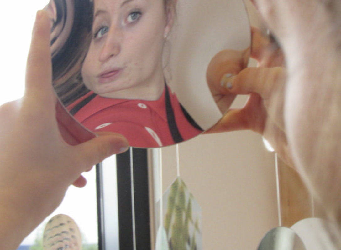
-I like this photo because it unusual angles aswell the mirror has distorted the image.
-We used a paper mirror and slowly bending to create different images. -Bending the mirror created an abstract image. -The picture has lots of curved line also the mirror shows lots of movement. -I like the composition. It very bright and there lots of lighting too. |
|


Even though I thought that my original image looked interesting in colour, I decided to change the image to black and white because we want try something new.
I did crop it because I want it to look better and everything that is not interesting need to be to crop and more look balance.
I did crop it because I want it to look better and everything that is not interesting need to be to crop and more look balance.
TYLER MITCHELL- "I CAN MAKE YOU FEEL GOOD"

"I REALLY LIKE THAT VISION OF YOUNG PEOPLE {LIVING} WITHOUT ANY ANXIETY OR STRESS. I WAS INTERESTED IN CANTERING A NEW PROTAGONIST WITHIN THAT NARRATIVE"
He born in Atlanta 1995 is photographer and filmmaker and make document a new aesthetic of blackness.
When he was young he used do lots of video of his friend doing skateboardingand selfie.
He born in Atlanta 1995 is photographer and filmmaker and make document a new aesthetic of blackness.
When he was young he used do lots of video of his friend doing skateboardingand selfie.


1. I think the background is effective one thing that didn't work out is hard to find good place and it hard to match the background .
2. I think other people would said it good and like the background and need more work.
2. I think other people would said it good and like the background and need more work.


1. I think 6 photo is a successful one because I like the laces covers her face it make look like wedding vibe.
White and red go well together make more pop out the colours, I like how the frames is .
White and red go well together make more pop out the colours, I like how the frames is .

2. My favorite photography from last lesson is this because I love the background is very bright colorful too.

- The task that we were doing is trying use the background color and used a props.
- We approach different is we used cover the face and we know that Tyler show lots of face.
- I find the used the color to match the background is fun it like the puzzles.
- I would do different is more color background and more props to use.
- I got the idea to use more props.


Today we were given the task to take some more photographs.I choose these 6 photos because i think they were the best ones that I took and they work for me. Instead of using fabric this time we experimented with flowers, lights and a fans. We used a variety of props and the background and trying used a natural light. I love first picture because I like the background the colorful lights with flower on the wall also wear the grey hat and hold posy flower it stand out to me.
NICK MEYER:


I think that Nick Meyer took these pictures in his local area to show people what the community is like. I think that these images all go together because they are based in one area and all have a running theme through them which is deterioration. Everywhere looks old and need some help. I think that these images show that these peoples lives are far from perfect.
This community looks like it has a lot of struggles, people in the photos look like they are homeless or maybe have addictions. Also things look abandoned in this community and some of the people also look like they have mental health problems,
There is man who looks like he is sitting in a park. You can see grass in the background. The man looks tired and sad. He also looks homeless as he has a bag next to him. The man has his head down on the bench, it almost looks like he is sleeping. Also the man doesn't have a coat so he looks very cold.
When I look at the this image I can see squares and curved lines. I can see white and grey colours - this makes me thing the photo was taken in the autumn. The image is light.
The thing I find most interesting about this image is the mans back. It is very curved which make it look as though he can't stand up straight.
If I could ask the artist one question it would be... is this man homeless? This is because he has a bag next to him and he looks as though he hasn't showered for a few months.
If I could give this picture a title I would call it 'Tired Man' because the man looks very tired.
I think this picture is about a man who has been abandoned by his friends and family and maybe now he has no where to live. The man has his eyes closed in the picture so it might be that he slept in the park over night.
I think the artist created this photo to show what it is like to be homeless. The artist wants us to feel sorry for the man in the picture.


I like this picture the best because I like the way how is placed.
- I picked 10 photos and printed them.
- Once they're ready , I start to arrange the photos to 6 different compositions.
- When I think they look good or look interesting I started to take a photo then upload them on my computer.
- Choose the one look best or like the most.
- Then print in A4 and evaluate it.
|
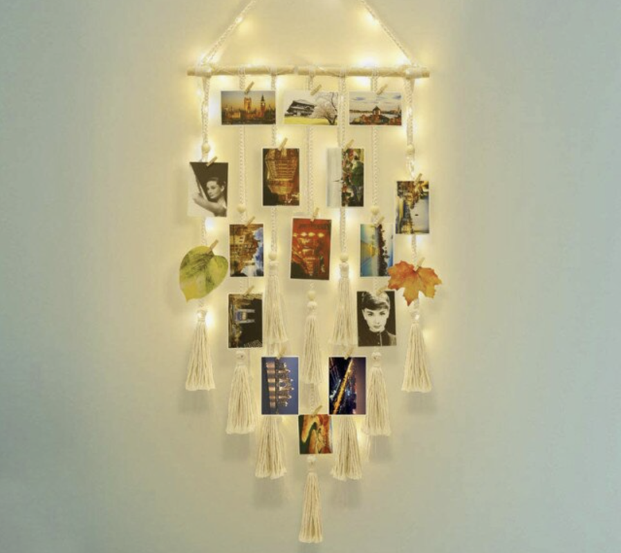
I choose this photo display because I like the fairy light stand out it make the photo brighter and it look good.
I like the shape like triangle on top then spread out end with like strings at the end. |
|


Evaluation
I print the 10 photos but instead of paper we used acetate.
we decided to display photos on a huge door with white paint windows and try to light up from back door but it really didn't work so we used it without and it come out good . The fact that the door looked old and some of the glass was either painted or scratched made it look really effective.
we decided to display photos on a huge door with white paint windows and try to light up from back door but it really didn't work so we used it without and it come out good . The fact that the door looked old and some of the glass was either painted or scratched made it look really effective.
I was responding to Daywood bey artist who challenge way in which black people from Harlem were depicted and I was using a props for example like flowers, fan and other things.
I was experimenting the photos so at first I using a Acetate paper and photo copy , I was going to use a string with fairy light but then someone mentioned that I can use the big door instead and I could display them on the square windows and I love the idea of it so I change my mind to the door, so I Start to put on the windows make sure they look okay then I took a photos and it look good.
I was working with Gracie and we were work out the theme, I was trying to show that the door always lets anyone or there enough room for everyone. I was make a connection Daywood bey by using a props eg: flowers, take photos walk around to the show the school vibes round here.
Zoe Leonard.
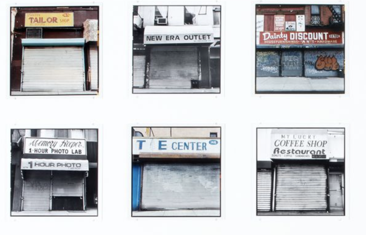
I have been looking at the shop front images by photographer Zoe Leonard. I chose these images because it shows a good variation of the images that Leonard took. Some of the images are in black and white and some of them are in colour. Another similarity is that the shops have shutters and have places for people to live above them. This may be because these shops are family/independently run and are not chain shops. The shutters could also mean that the shops are in a dangerous area because they add more safety to the shop.
The colours of the shop fronts are quite similar too, they are mostly primary colours that are dull now because of their age. They also took quite dirty and uncared for. They look like they could have closed long term. I think that Leonard may have taken these pictures to document what is happening in this community to try and provoke a response to save these family business'. Most of the shops seem to be falling apart slowly and this makes me think that the owners do not have any money for repairs.
These images make me feel sad because I think of all the shop owners that have lost money and their jobs when the shops closed. Also I want people to try and help these owners. They could be in debt and because there is no-one using these shops they cannot get out of debt. It also makes me think where did all the people go that used to use these shops. Have they moved away?
If I could meet Zoe Leonard I would like to ask her why she chose to photograph these shops fronts and what she wanted to achieve from showing these to people.
